Shopkick Rebrand
Overview:
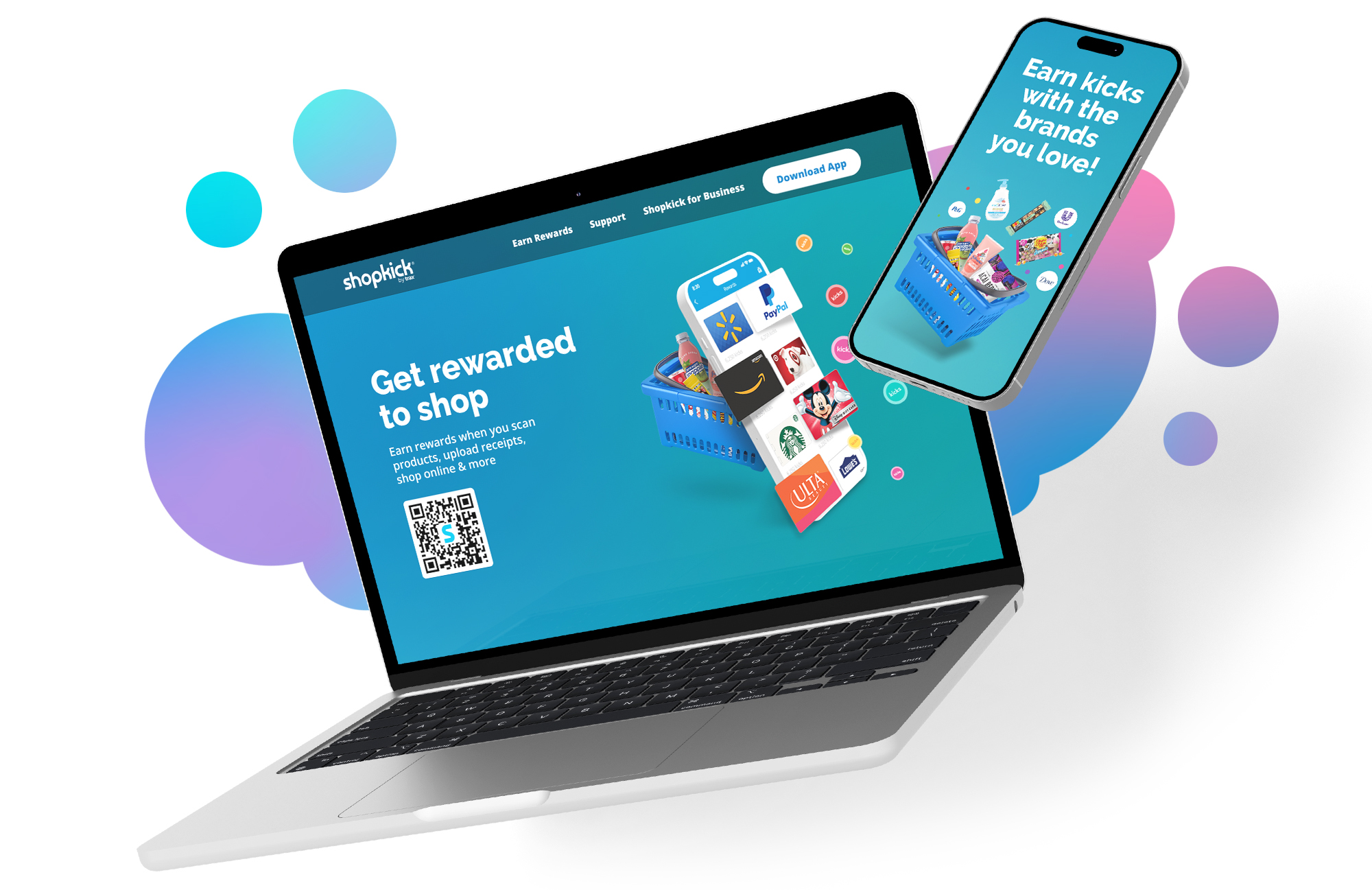
This project aimed to refresh Shopkick’s core brand elements and elevate the user experience on the website, which felt outdated at the time.
My Role:
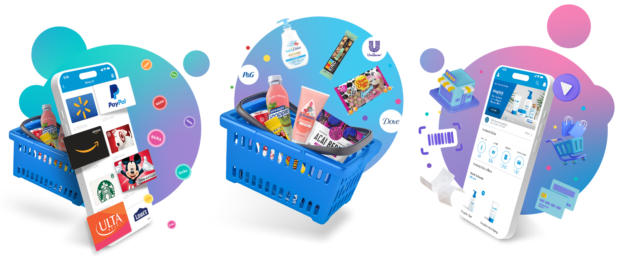
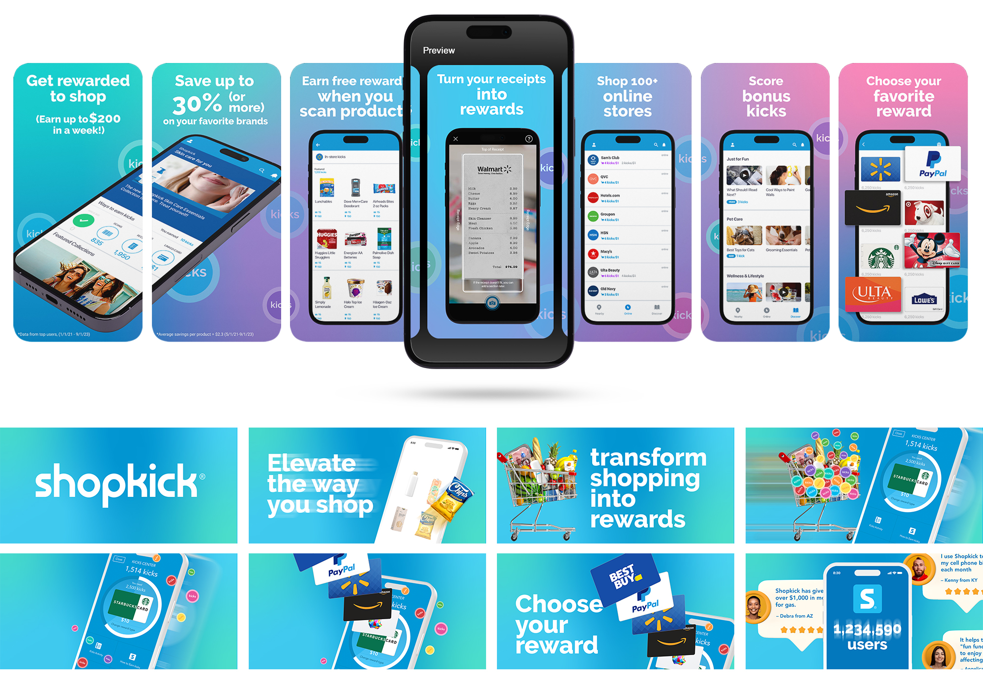
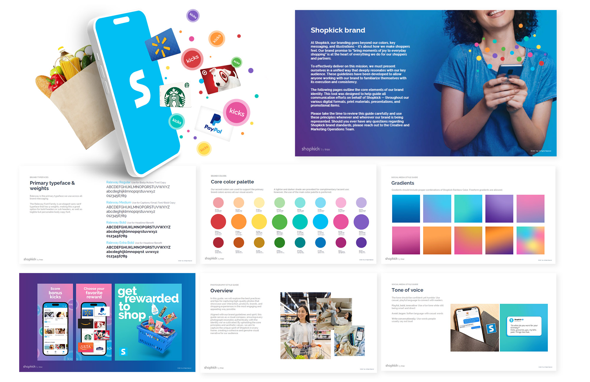
As Senior Art Director & Creative Lead, I led the visual refresh by merging classic elements (like Shopkick’s iconic confetti) with fresh trends: the freeform gradients. I developed a renewed and accessible “Shopkick Rainbow” palette and extended the design system to the website, ensuring a cohesive, engaging user experience. Additionally, I overhauled the brand guidelines user manual, updating font usage and introducing new sections for social media and photography to empower internal teams and partners with clear, adaptable design standards.
Results:
The redesign led to a significant boost in user engagement, with reports indicating a 3x increase in user interactions and a 5x rise in highly engaged users. Additionally, the updated design enhanced consumer trust and satisfaction, contributing to sustained brand loyalty.
Credits:
Social Media & Photography Sections on Brand Guidelines: Sarah Scott & Sarah Roberts.
